Gravity Forms has CSS Ready Classes to style your form fields. Using these classes, you can easily create more advanced layouts for the fields in your forms. Excellent idea, however, the problem is you always need to remember what the exact class name is. Now with this CSS Ready Classes selector, you don’t need to remember. Simply click on a button to launch the pop-up and choose the class you want to add.
Add your custom CSS
You can add your own CSS to the GravityWP – CSS Selector easily in your functions.php file. Just add the following code there. It adds quick buttons and an accordion on top of the modal. That way you can put easily your own CSS in the layout you want.
// Add custom css: quick buttons and accordion at the top of the GravityWP - CSS Selector modal
function my_custom_gwp_css_selector_add_css() {
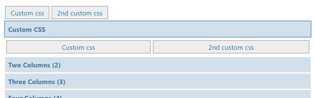
$html .= "<div class='gwp_quick_links'>
<a class='gwp_css_link' href='#' rel='css_class' title='Insert css_class'>Custom CSS</a>
<a class='gwp_css_link' href='#' rel='css_class_2' title='Insert css_class_2'>2nd Custom CSS</a></div>
<li>
<a class='gwp_css_acc_link' href='#'>Custom CSS</a>
<div class='gwp_css_accordian'>
<a class='gwp_css_link' href='#' rel='css_class_3' title='Insert css_class_3'>3rd Custom CSS</a>
<a class='gwp_css_link' href='#' rel='css_class_4' title='Insert css_class_4'>4th Custom CSS</a>
</div>
</li>";
return $html;
}
add_filter( 'gwp_css_selector_add_custom_css', 'my_custom_gwp_css_selector_add_css' );
Using the CSS Selector
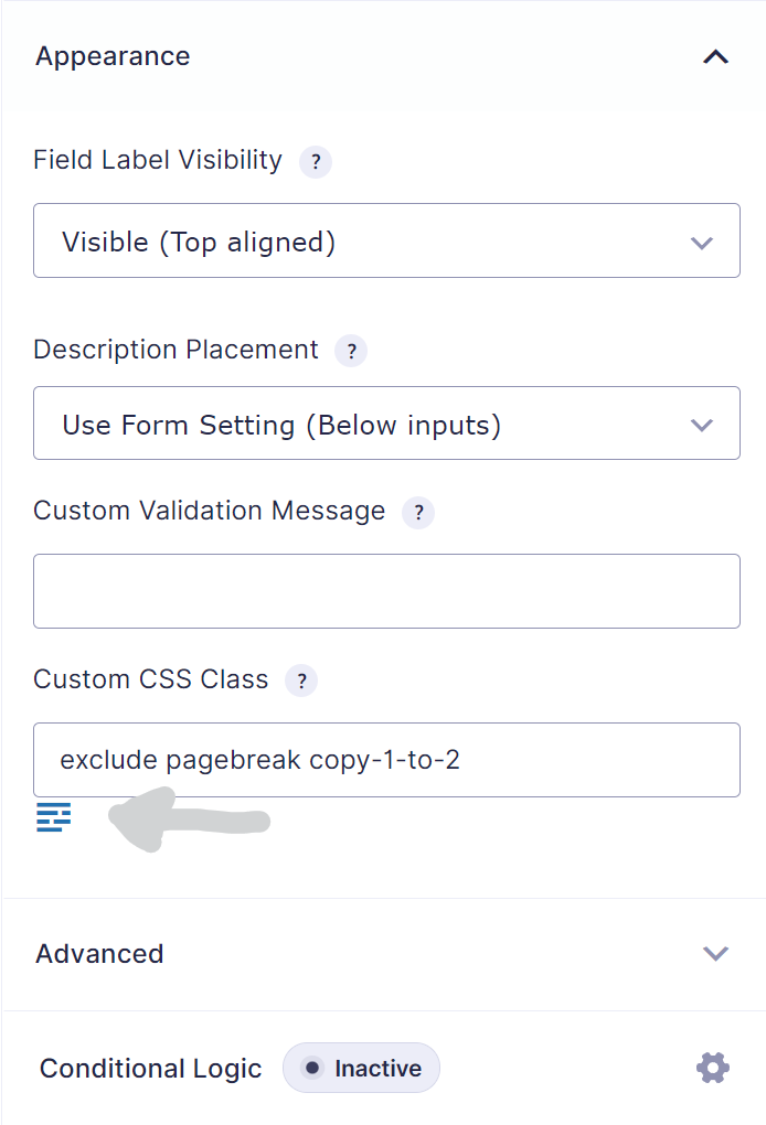
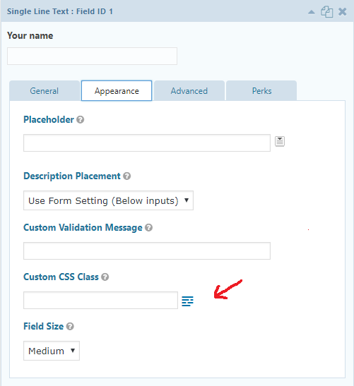
Edit your form in the Form Builder. Then select the field you want to add the CSS Ready classes to. You can add the classes in the input field ‘CSS class name’ under the ‘Appearance’ tab. In the next steps you can find the most commonly used classes. They pretty much speaks for themselves, however a more detailed description is available at the Gravity Forms documentation site. Good to know:
- You can use more than one class for one field.
- You can also add your own classes.
Overview of available CSS Ready classes in Gravity Forms
This paragraph gives an overview of the possible CSS ready classes which can be used in Gravity Forms.
List Classes
- gf_list_2col
- gf_list_3col
- gf_list_4col
- gf_list_5col
- gf_list_inline
- gf_list_height_25
- gf_list_height_50
- gf_list_height_75
- gf_list_height_100
- gf_list_height_125
- gf_list_height_150
Gravity PDF
- exclude
- pagebreak
GP Copy Cat
copy-1-to-2
Other Classes
- gf_scroll_text
- gf_hide_ampm
- gf_hide_charleft
- gf_section_right
- gf_invisible
Deprecated (only 2.4 and earlier)
Halves (2 Columns)
- gf_left_half
- gf_right_half
Thirds (3 Columns)
- gf_left_third
- gf_middle_third
- gf_right_third
Inline (Fluid One Line)
- gf_inline
Quarters (4 columns)
- gf_first_quarter
- gf_second_quarter
- gf_third_quarter
- gf_fourth_quarter
If you’re (old) theme doesn’t support Gravity Forms 4 quarters CSS, you can add this code to your style.css file: WebEndevSnippets.
Our Premium add-ons for Gravity Forms

JWT Prefill
Fill forms with data you can trust. Prefill Gravity Forms fields with a secure token instead of links with editable url parameters, so your data is accurate, tamper-proof, and ready to use.

Update Multiple Entries
Trigger the update of multiple entries in a target form by submitting an entry in a trigger form.

All Entries
All your new Gravity Forms entries in one central place. Stop navigating between multiple forms to find new entries. Get immediate oversight and full control with a powerful, unified dashboard.

Advanced Number Field
Functionality for Number Fields, like rounding or only absolute numbers, fixed point notation, range calculation, custom units like % or m2 & show as slider.
Read tutorials about

Gravity Forms Discount Code Field: Apply Fixed or Percentage Discounts in a Form
Learn how to create a Gravity Forms discount code field that applies fixed or percentage discounts. This tutorial shows how to calculate subtotals, discount amounts, and final totals using tested form logic.

Gravity Forms Zoom Integration: Create Zoom Meetings From Booking Forms
Learn how to connect Gravity Forms to Zoom without Zapier using GravityWP API Connector. This step-by-step tutorial shows how to create Zoom meetings from booking form submissions and save the returned meeting details back to Gravity Forms.

Gravity Forms monday.com Integration: Create New Items From Form Submissions
Learn how to connect Gravity Forms to monday.com without Zapier using GravityWP API Connector. This step-by-step tutorial shows how to create new monday.com items from form submissions and save the returned monday.com item ID back to Gravity Forms.

Gravity Forms Pipedrive Integration: Send Form Contacts to Pipedrive Without Zapier
Learn how to connect Gravity Forms to Pipedrive without Zapier using GravityWP API Connector. This step-by-step tutorial shows how to send form contacts, custom fields, and the returned Pipedrive Person ID directly from WordPress to Pipedrive CRM.