Do you want to create pie charts based on your Gravity Forms entries? With GFChart, you can turn form submission data into visual charts, including normal pie charts, donut charts, and 3D pie charts.
This is useful when you want to show survey results, poll answers, feedback summaries, or simple reporting data on a WordPress page. Instead of reading every entry one by one, a pie chart gives visitors and admins a quick visual summary of the submitted answers.
In this tutorial, you’ll learn how to create a pie chart from Gravity Forms entries using GFChart and its shortcode builder.
What you’ll build
By the end of this tutorial, you’ll have a pie chart that displays data collected through a Gravity Forms field. The chart can be shown on a page or post using the shortcode generated by GFChart.
For example, if your form asks users to choose their favorite product, event option, service type, or answer choice, GFChart can turn those submitted answers into a visual pie chart.
You can create different pie chart styles depending on how you want the data to appear:
- A normal pie chart for a simple visual breakdown
- A donut chart for a cleaner circular chart style
- A 3D pie chart for a more visual chart effect

When to use a pie chart in Gravity Forms
Pie charts work best when your form collects answers that can be grouped into clear categories. They are useful when you want to compare parts of a whole.
Common examples include:
- Survey results
- Poll answers
- Event registration choices
- Product or service preferences
- Customer feedback categories
- Internal reporting dashboards
- Donation campaign breakdowns
- Membership or application types
For example, if a form asks “Which workshop do you want to attend?”, a pie chart can show how many people selected each workshop. If a feedback form asks users to rate a service, a pie chart can show the distribution of responses.
A pie chart is not ideal for every type of data. If you need to compare many categories or show changes over time, another chart type may be easier to read. But for simple grouped answers, pie charts are a clear and familiar option.
Before you create the pie chart
Before configuring GFChart, make sure your Gravity Forms form already has entries to work with.
GFChart needs submitted data from a form field. This usually works best with fields such as:
- Dropdown fields
- Radio button fields
- Checkbox fields
- Survey-style choice fields
- Other fields with repeated answer values
If your form has no entries yet, submit a few test entries first. This will make it easier to preview the chart and confirm that the data displays correctly.
Step 1: Open the GFChart shortcode builder
After installing and activating GFChart, open the shortcode builder from your WordPress dashboard.
The shortcode builder is where you choose the chart type, select the Gravity Forms data source, adjust the chart settings, and preview the final result.
This is also where GFChart generates the shortcode you can place on a WordPress page or post.
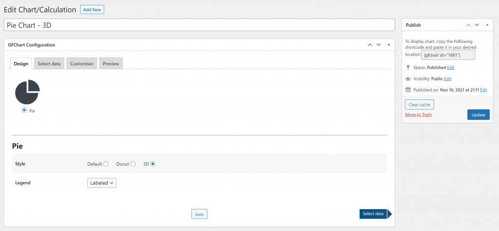
Step 2: Choose the pie chart type
In the chart settings, choose Pie Chart as the chart type.
GFChart lets you configure the chart style and legend. The legend helps readers understand what each slice of the pie chart represents.
For example, if your chart displays survey answers, the legend can show the answer choices next to the matching chart segments.
Step 3: Select the Gravity Forms data source
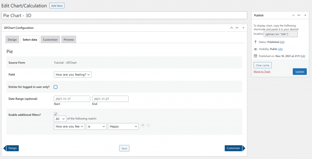
Next, choose the Gravity Forms form that contains the entries you want to display.
Then select the field that should be used for the chart data. This field should contain the answer choices or values you want GFChart to count and display.
You can also use filters if you only want the chart to include specific entries. For example, you may want to show entries from a certain date range or only include submissions that match a specific condition.
Step 4: Adjust the chart title and layout
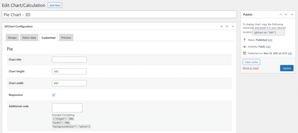
After selecting the data source, configure how the chart should appear on the page.
You can add a chart title, set the chart height and width, and enable responsive behavior. A responsive chart is helpful because it can adjust better across desktop, tablet, and mobile screens.
Keep the chart title short and clear. A good title should tell readers what the chart shows without needing a long explanation.
For example:
- “Workshop Registration Choices”
- “Customer Feedback Results”
- “Most Requested Services”
- “Preferred Contact Method”
Step 5: Preview the chart
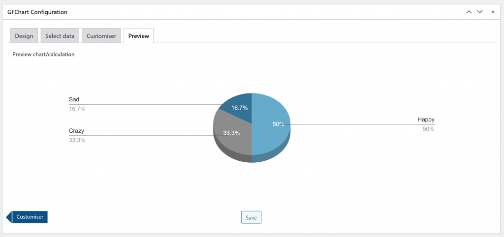
Before publishing the chart, use the preview option to check how it looks.
The preview helps you confirm that GFChart is using the correct form, field, and settings. It also lets you see whether the chart is easy to understand.
Check that:
- The chart displays the expected data
- The legend labels are clear
- The chart title is accurate
- The chart size works for the page
- The selected style matches the purpose of the chart
If the chart does not show the expected results, go back and review the selected source form, field, filters, and date range.
Step 6: Add the chart to a page or post
Once the chart looks correct, copy the shortcode generated by GFChart.
Then open the WordPress page or post where you want the chart to appear and paste the shortcode into the content area.
After publishing or updating the page, view it on the front end to confirm that the chart appears correctly for visitors.
If the chart will be used for reporting, you may want to place it on a private page, admin-only page, or internal dashboard. If it is used for public survey or poll results, you can place it on a public page where visitors can view the summary.
Practical use cases for Gravity Forms pie charts
Pie charts can be helpful whenever you need a quick visual summary of form entries.
For example, a school could use a Gravity Forms pie chart to show which workshop students selected. A nonprofit could use it to summarize donation preferences. A business could use it to display customer feedback results from a simple survey.
You can also use pie charts for internal reporting. Instead of exporting entries and creating a chart manually, you can show a visual summary directly inside WordPress.
This makes GFChart useful for simple dashboards, reports, surveys, polls, and form-based summaries.
Tips for better pie charts
A good pie chart should be easy to read at a glance. If the chart has too many slices, the result can become confusing.
For best results:
- Use fields with clear answer choices
- Keep the number of categories manageable
- Use a short chart title
- Show a legend when the labels need context
- Test the chart on mobile
- Avoid using pie charts for long lists of values
If your data has many categories, a bar chart may be easier to read than a pie chart.
Final thoughts
Creating a pie chart from Gravity Forms entries is a useful way to turn form submissions into a visual summary. Instead of reviewing entries one by one, you can show the results directly on a WordPress page or post.
GFChart makes this easier by letting you choose the form, select the field, configure the chart style, preview the result, and place the chart with a shortcode.
Use pie charts when your data has clear categories and you want to show how each category contributes to the total. For surveys, polls, feedback forms, and simple reports, this can make Gravity Forms data much easier to understand.
Frequently asked questions
Yes. GFChart can be used for other chart types, including bar charts, pie charts, 3D pie charts, and donut charts. For a broader overview, see the GFCharts charts and reports for Gravity Forms page.
Yes. Pie charts are a good fit for survey and poll results when the answers are grouped into clear choices. For example, you can chart how many users selected each answer in a dropdown, radio button, or checkbox field.
Yes. GFChart needs form entry data to generate a useful chart. If your form is new, submit a few test entries first so you can preview the chart during setup.
Yes. GFChart includes options for selecting the source form, field, date range, and additional filters. This helps you control which entries are included in the chart.
You can find related tutorials on the GFChart tutorials page. It includes tutorials for pie charts, bar charts, progress text, and progress bars.
Our Premium add-ons for Gravity Forms

List Dropdown
Add a Dropdown Select with choices to a column or multiple columns in a Gravity Forms List Field.

API Connector
Connect Gravity Forms to External API's: Query the API using form field values and automatically fill other form fields with the API response.

Advanced Number Field
Functionality for Number Fields, like rounding or only absolute numbers, fixed point notation, range calculation, custom units like % or m2 & show as slider.

Entry to Database
Integrates Gravity Forms with internal or external databases, offering flexible mapping of form fields to database columns and real-time synchronization between entries and database rows.
Read tutorials about

How to Validate Repeatable Contact Rows in Gravity Forms
Learn how to validate repeatable Gravity Forms List field rows with GravityWP List Text. This tutorial shows how to add email and regex validation, test invalid values, and confirm that valid team roster data is stored correctly.

Gravity Forms Airtable Integration: Create Records From Form Submissions
Learn how to build a Gravity Forms Airtable integration with GravityWP API Connector. Send form submissions to Airtable, create new records automatically, and save the returned Airtable Record ID and response back to Gravity Forms.

Gravity Forms Asana Integration: Create Tasks From Form Submissions
Learn how to connect Gravity Forms to Asana with GravityWP API Connector. This tested workflow creates Asana tasks from form submissions and saves the returned task ID and URL back to Gravity Forms.

Gravity Forms Google Calendar Integration: Create Events From Form Submissions
Connect Gravity Forms to Google Calendar with GravityWP API Connector. Learn how to create calendar events from form submissions, map event details, configure OAuth 2.0, handle time zones, and save the returned Event ID and URL.

