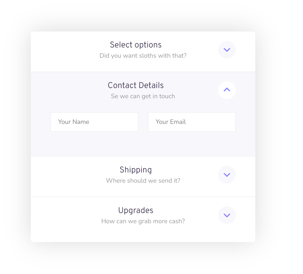
Do you want to use accordions inside your Gravity Form to make it more compact and easier for you form visitors to get an overview of the form content or the ability to reveal or collapse parts of the form? With the Gravity Forms Collapsible Sections Add-on from JetSloth you can turn Sections in your form into accordions.
Turn a Gravity Forms Section into an accordion
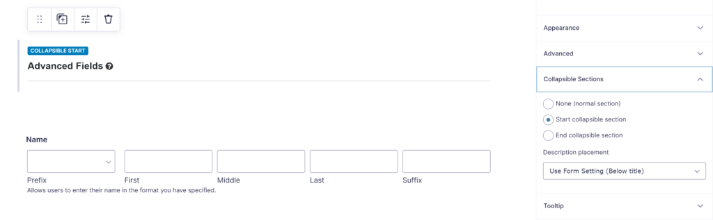
When the Gravity Forms Collapsible Sections Add-on from JetSloth is activated, you get an extra option tab in the Section Field settings: Collapsible Sections. You can choose there:
- None (normal selection): This will keep the section the way you’re used to.
- Start collaspible section: This will mark the top of the accordion, the accordion starts here.
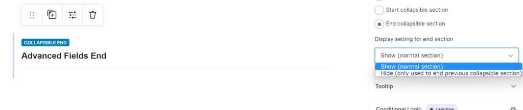
- End collapsible section: This will mark the end of the accordion.
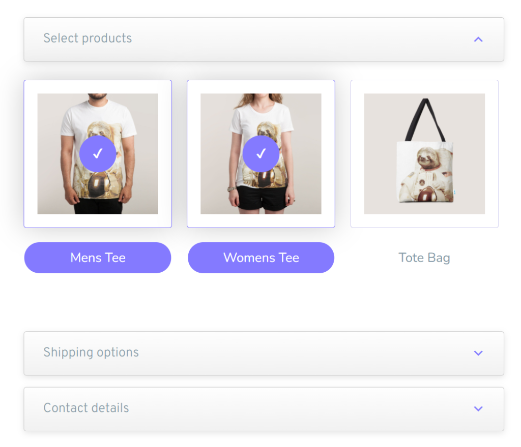
End of accordion
You can add sections inside the accordion. When you start a new collapsible section, the previous one will automatically end. You can also add a section purely to end the current accordion, but choosing for End collapsible section and choose for Hide (only used to end previous collapsible section).
Available Settings for the accordions
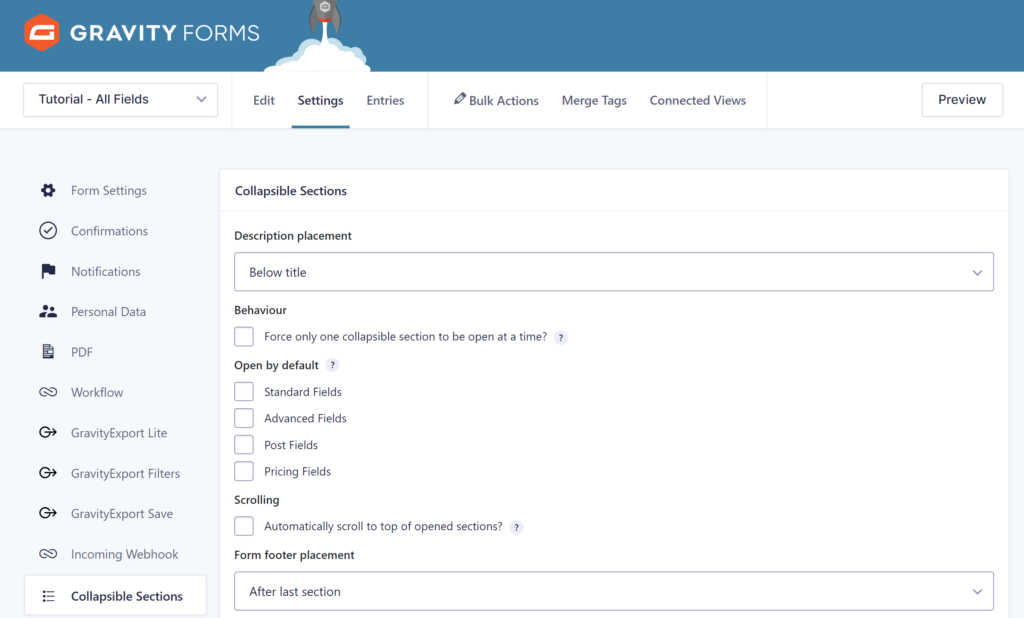
In your Gravity Form Settings, you have extra options available:
- Behaviour: you can force to only have one collapsible section open at the same time. The accordion will then always have only one section opened.
- Open by default: You can select one or more of the collapsible sections (accordions) that should be opened when you load the form.
- Scrolling: enable automatically scrolling to the top of the opened sections.
- Form footer placement: by default the Gravity Form Footer (with the next / previous / submit buttons) will be shown at the bottom of the form. With this setting you can place the footer inside the last section (it will only be visible when the last accordion is opened).
Styling Gravity Forms accordion sections
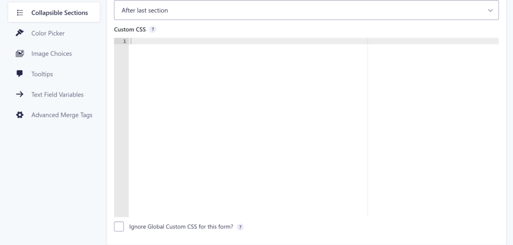
JetSloth produced some wonderful tutorials about styling the accordion sections. You can easily add custom CSS to your collapsible sections in the Gravity Form Settings:
Examples custom styling

Our Premium add-ons for Gravity Forms

Field to Entries
Create entries based on Checkboxes & Multi Select choices & List Field rows.

Update Multiple Entries
Trigger the update of multiple entries in a target form by submitting an entry in a trigger form.

Entry to Database
Integrates Gravity Forms with internal or external databases, offering flexible mapping of form fields to database columns and real-time synchronization between entries and database rows.

API Connector
Connect Gravity Forms to External API's: Query the API using form field values and automatically fill other form fields with the API response.
Read tutorials about

How to Create a Public Submission Business Directory in WordPress (Gravity Forms + GravityView)
Build a moderated business directory where users submit listings through a form, admins approve entries, and approved businesses appear in a searchable GravityView directory.

How to Create an Event Workshop Registration + Waitlist System in WordPress
This guide shows how to set up a workshop registration + waitlist system in WordPress: register attendees until capacity is reached, waitlist the rest, approve entries, and auto-promote people when a seat opens using Gravity Forms, Gravity Flow, and GravityView.

Gravity Flow Form Submission Step Tutorial
The Gravity Flow Form Submission step pauses a workflow until another form is submitted, then continues once the handoff is complete. This guide shows how to connect two forms, prefill fields with mapping, send the correct secure link, and troubleshoot the most common “workflow didn’t move” issues.

Gravity Flow Delete an Entry Step Tutorial
The Gravity Flow Delete Entry step lets you trash or permanently remove Gravity Forms entries as part of a workflow. This guide covers the key settings, scheduling options (delay or date-based), and safe testing tips so you can follow retention and privacy rules with confidence.

